hey yall its me the Art Mom™ to help you shade pretty
rule 1: DO NOT SHADE WITH BLACK. EVER. IT NEVER LOOKS GOOD.
red– shade with a slightly darker shade of purple
orange– slightly darker and more saturated shade of red
yellow– i think like..a peach could work but make it a really light peach
green– shade with darker and less saturated shade of blue or teal
blue– shade with purple
purple– a shade thats darker than the purple you’re using and maybe a little pink (MAYBE blue)
pink– darker shade of red
white– a really light lavender or blue..or i guess any really light colour??
black– okay listen dont use pure black to colour anything unless you want to leave it with flat colours because you cant really shade black lol
grey– a slightly darker shade of purple or blue (less saturated)
brown– slightly darker and less saturated shade of purple or red
aaaaand thats all i got lol. let me know if there is anything i should add to this list!!
If you’re a visual learner…
I made some Balls of Colour to go with Art Mom™’s post:
thank you for the advice
^^^^
this is not how color theory works. learn color theory and lighting and stop telling people to -never- use colors. It’s true that some people misuse black in their shading but telling people how to shade across the board (especially using this boring tutorial?) won’t help them.
try to shade using nonblack colors, it will help you learn. BUT eventually you’ll get a better understanding of color, especially if you do some color theory and lighting studies and/or classes (preferably both) and understand it’s not nearly as clear-cut as this post makes it seem.
color and what colors you use to shade depend 100% on the lighting and the subject. this tutorial comes from no technical colorist basis and won’t give you great results in the long run
Also pleaaaase pay attention to your values. Colours can be pretty but if you have no contrast your art is going to look very flat and have no depth. Only the black and grey in these examples has any sense of it being an 3D object because the colours chosen lack enough value range and are chosen on the basis of looking pretty alone.
Your shadows should be defining the shape of the object & showing where there is less light, meaning the values should be darker, not just another colour with the same value level.
Shading with other colours is a nice starting point but yeah don’t rely on different colours alone
im not a pro at this field cuz im also still learning, but i hope u find this helpful anyway Kevin. ^ ^;;;
ill try to help as much as i can ! also for the best tips, use ur own clothes as reference~ its easier cause u got to clearly see where the folds and creases are! ^0^/
It’s Meg for this week’s TUTOR TUESDAY! I’ve been wanting to cover perspective again for awhile because my old tutorial is…well…let’s just say I’ve gotten better at formatting these. Plus there’s so much more to learn! If you have any recommendations send ‘em in here or my personal! Have fun, keep practicing, and I’ll see you next week!
A quick tutorial/cheat sheet on how I draw kisses!! I’m going to assume you already know how to draw a head and how to angle it, because that’s an entire procedure in itself. I’m going to focus on mainly the lips and also try and tackle some common mistakes when you’re first starting out.
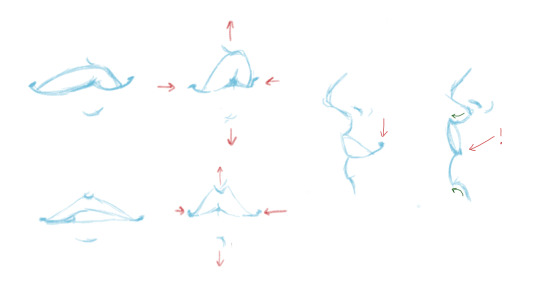
Pursing the lips
So this is boring but crucial. If you don’t purse, their is no real kiss (take notes) bc placing your lips on top of someone else’s is not how you kiss… The most important part are the corners of the mouth, especially from the side view, because that’s what changes the most.
The actual kissing yeee
Let’s start do a basic side view kiss on the lips. And believe it or not, I think this one is the hardest!
Think about which parts of the face are going to be in front of the other! This can take some time to get the hang of, but once you get that down it’s easy. Also, focus on getting the heads at the right distance and angle. A common mistake is drawing them too close.
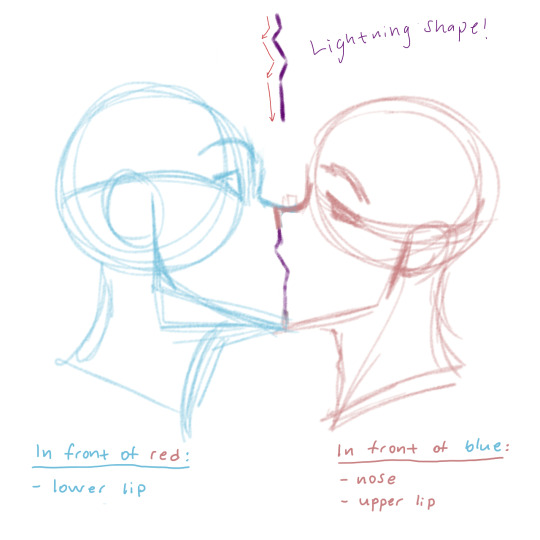
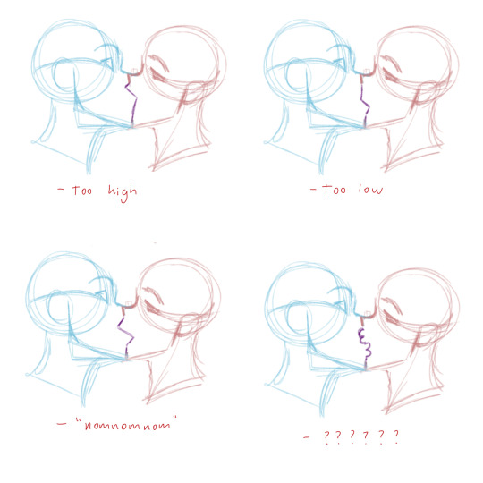
The Lightning Shape:
Still keeping in mind which part of the line is “Red’s” upper lip and which part is “Blue’s” lower lip, play around with the shape of the lightning. Very subtle changes can have a very strong impact! I usually go by feel, so take your time, but here are some things to look out for:
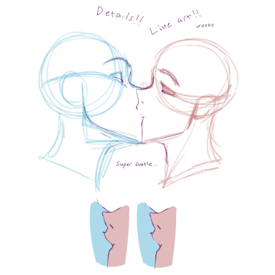
Details squishing etc.
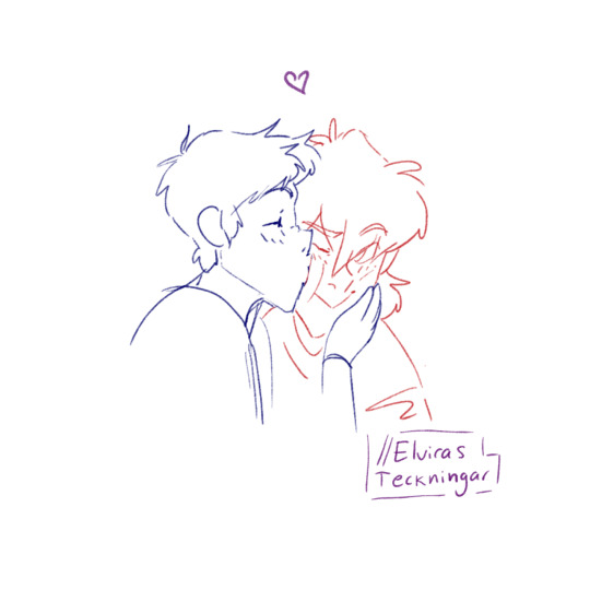
So yeah once the lightning shape looks good, I usually add details and squish parts of the face that will touch. Which usually includes the noses, but from this angle they won’t squish unless you intend on making nice big noses <3. By now it should look something like this:
You don’t have to add the corners of the mouth! I usually do when I want to show that the character is smiling.
One technique used a lot in anime/manga + other cartoony art styles, is fading lines where two soft-ish objects press hard against each other. The picture above explains it.
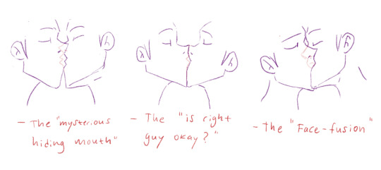
Common mistakes
Getting down the crucial kissing part of fanart is hard and you will mess upp SO MANY TIIIIIIMES, but you learn from your mistakes, so don’t be discouraged. There are some things though that I frequently see when people draw kisses that makes it look awkward and stale, many of which I used to do myself. Here are some examples:
Try your best to avoid these. Most of the mistakes have little to do with the lips and more to do with the angle of the head. So getting that down before you move on to the lips is important.
¾ view Kissing
There are not a lot of angles where you actually see the lips meet (or at least not that I can draw…). Depending on how the heads are placed in relation to each other, you may or may not see the lips in a ¾ view. The way I have demonstrated is done in a way that the nose will bump into the other’s upper cheek.
Aaand that’s about it! These things will make more and more sense the more you draw them. At first it can seem very hard with so many things to keep track of, and it is, but practice makes perfect!
Rule of thumb: does the angle and position of the heads make sense? How are the lips going to align? What parts of the face are going to be in front of the other? How much will the lips purse? And finally, what is going to squish?